

Case study
SMARAGD 1969 — REBRANDING
A clearer, more confident brand system for Smaragd 1969 and its next chapter.
About the project
Client
Smaragd 1969
Year
2025
Industry
Jewellery / Luxury Retail
What we did
Strategy / Creative
THE APPROACH
A clearer system for the next chapter
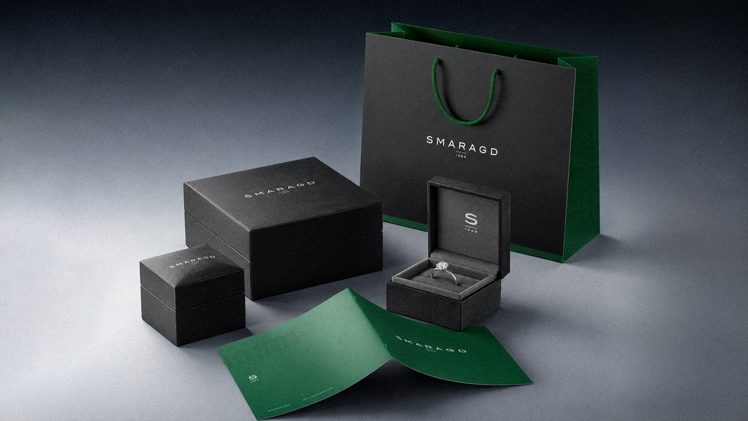
Smaragd 1969 needed a brand system that could carry the weight of its heritage while feeling ready for what comes next. We focused on clarity, confidence and consistency across the moments where the brand meets its audience.
The visual language


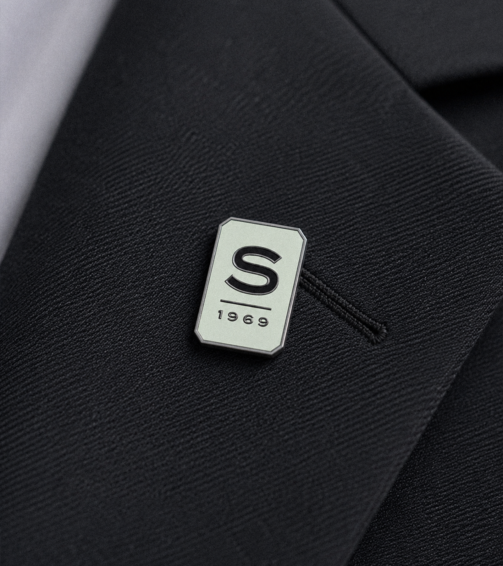
WHAT WE DID
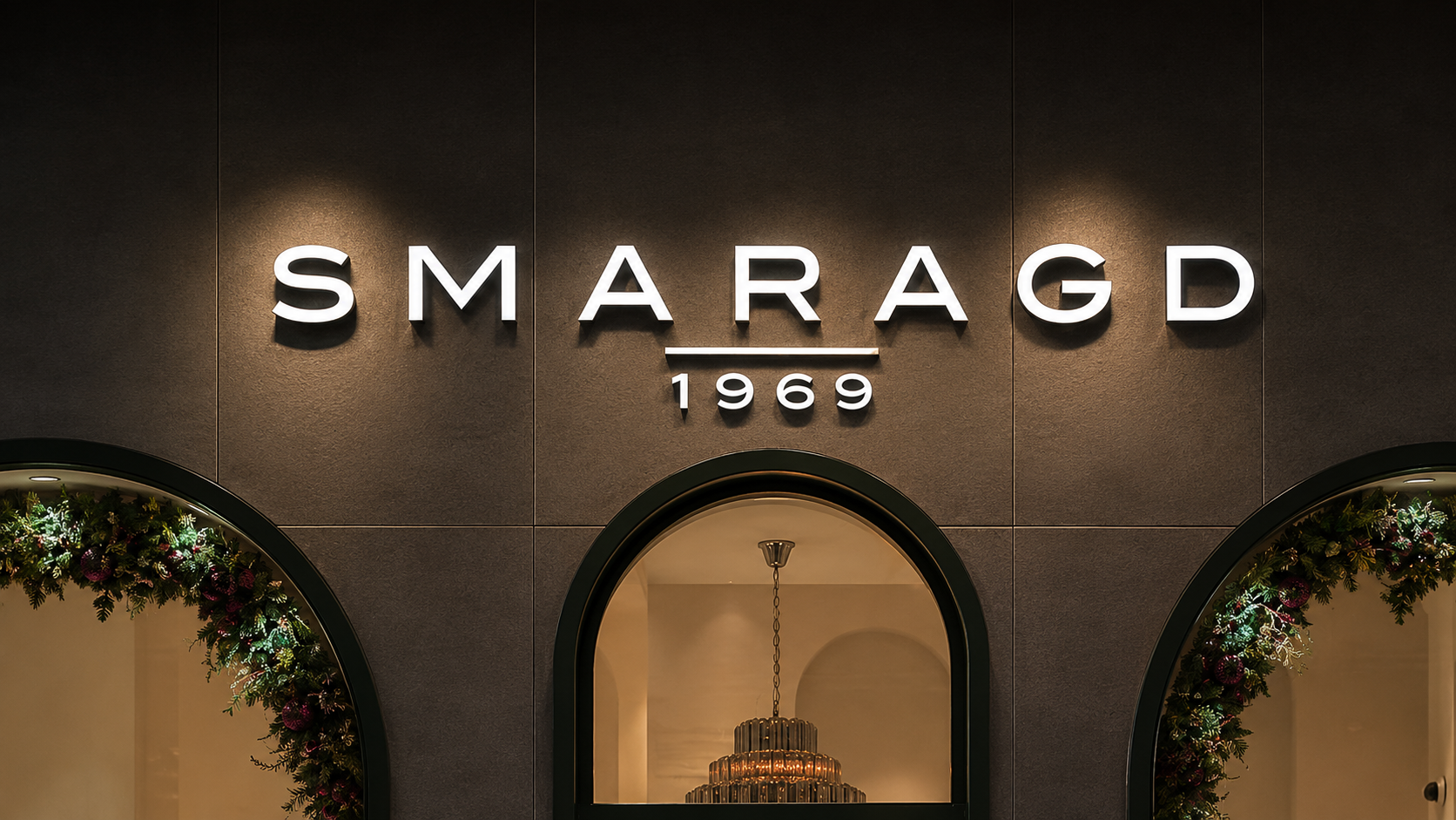
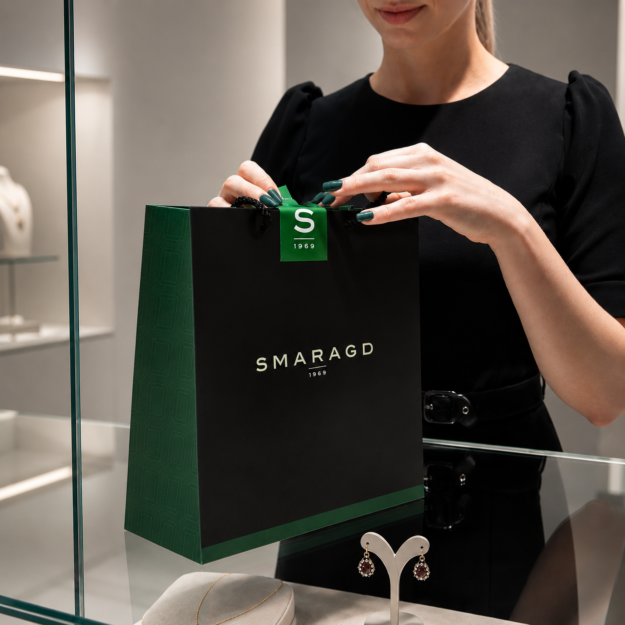
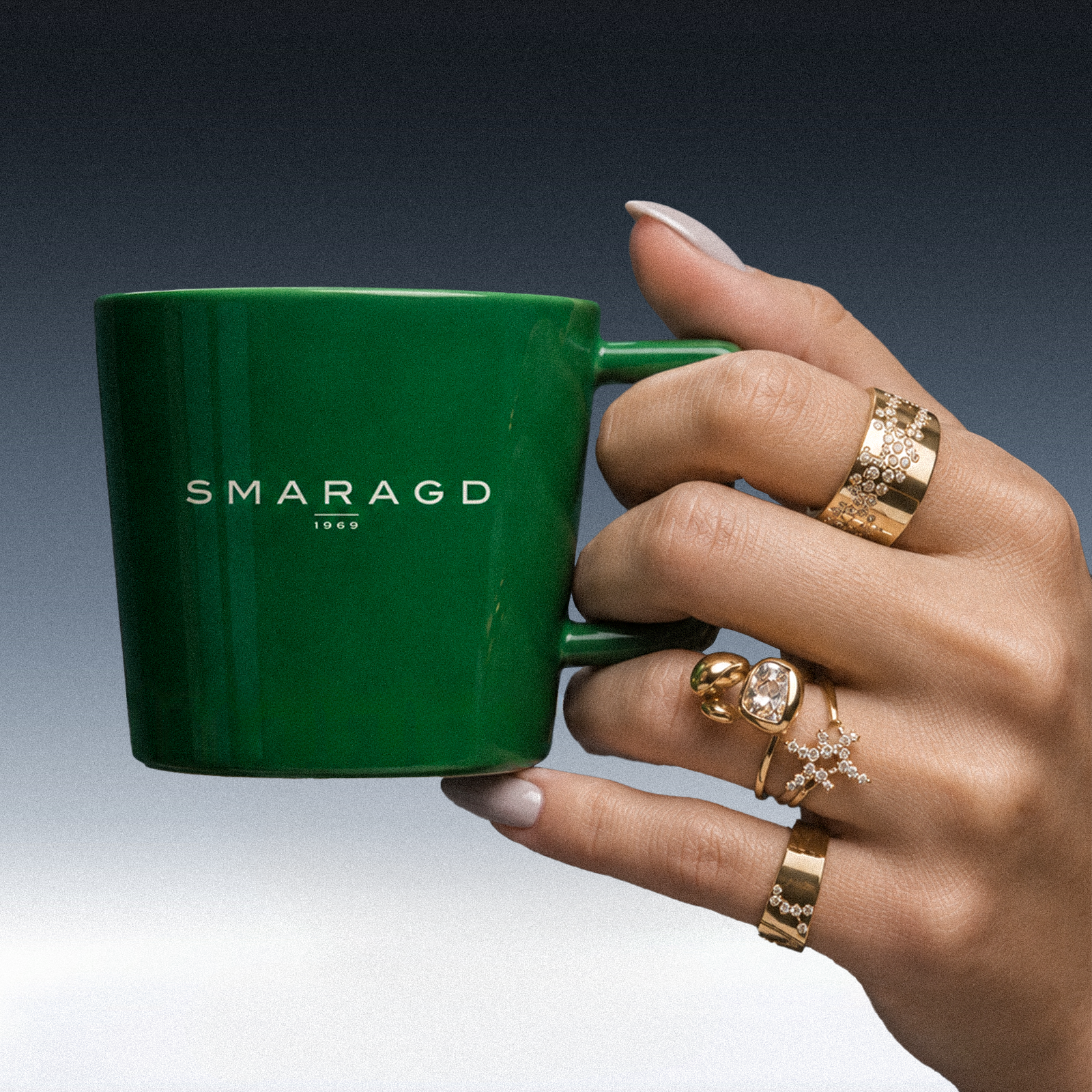
We shaped the rebrand as a connected system: positioning, visual direction, identity rules and the practical tools needed to make the new expression recognisable wherever it appears. The result gives Smaragd 1969 a stronger foundation for communication across jewellery, retail and digital touchpoints.
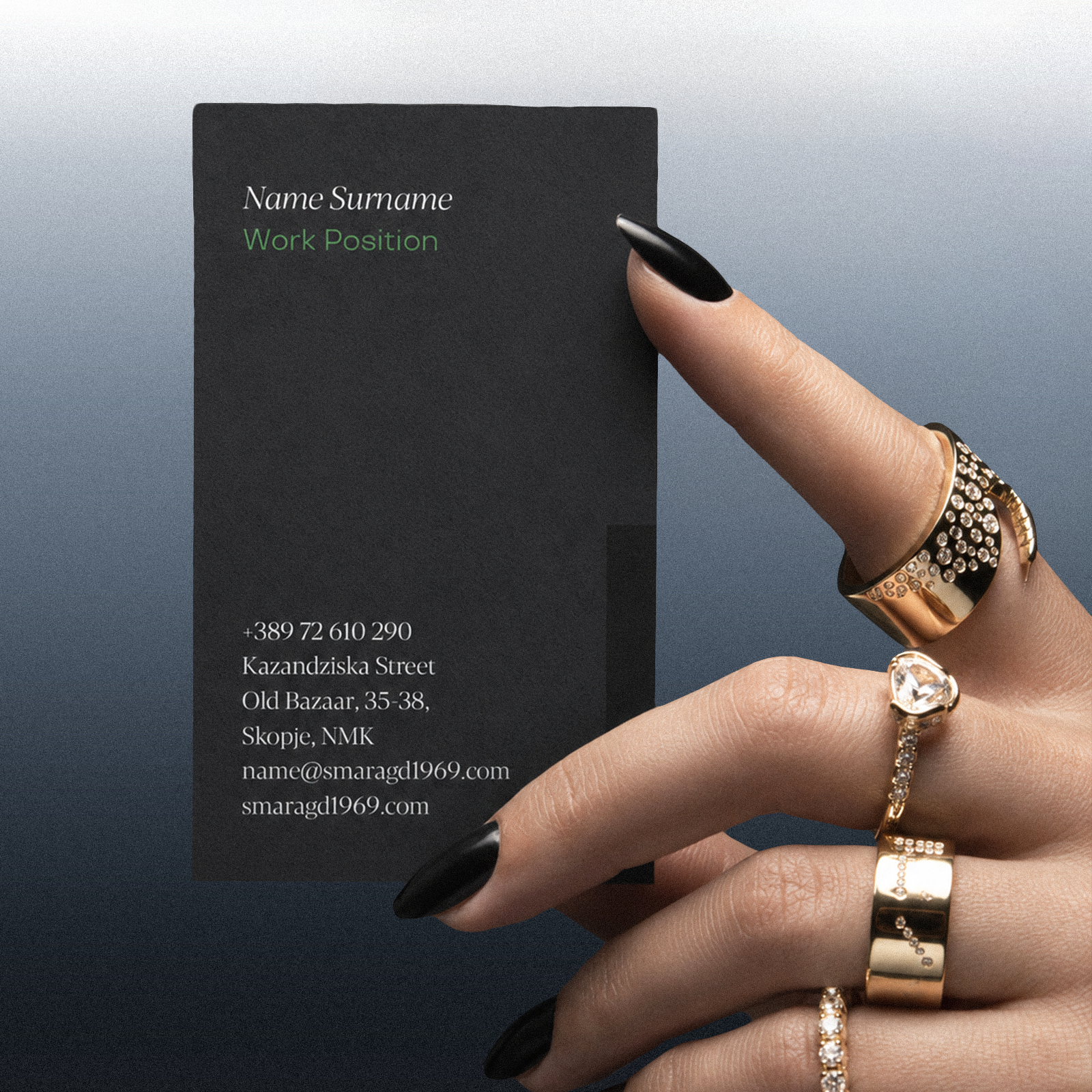

THE OUTCOME
The new direction balances the authority of Smaragd 1969 with a more contemporary rhythm. It makes the brand easier to recognise, easier to use and more prepared to grow without losing the character that made it valuable in the first place.

Next case study